DHS Website Remodel
A UI/UX Case Study
This Case Study is focused on developing a solution for the outdated, scattered, and inconsistent design of current government websites, primarily focusing on redesigning the DHS Website as a template that all other federal and executive branches / services can mimic.

Introduction:
-
Exploring UI / UX enhancements of United States Websites, with an initial focus on DHS.gov
-
Addressing fragmented services through the Citizens Dashboard
Streamlining processes and improving user experience
Tailored alerts and notifications based on location
Consolidation of primary user actions
-
Gov Websites current layout is vastly different from branch to branch, by creating a consistent layout the websites would feel more usable, like they are all given the same amount of attention, and make it easier for visitors to find the information they need.
In the case of a required action for governmental bureaucracy, a Citizens Dashboard will make it easier for citizens to receive notices from the government, be alerted to what actions are required, and be provided all the resources necessary to accomplish that task in one place.
-
My task as the UX/UI Researcher and Designer was to ascertain problems with current Users experience while using local or federal government websites, develop a solution, and test the efficacy of the solution.
Problem Definition:
-
Inconsistent user experience across government websites
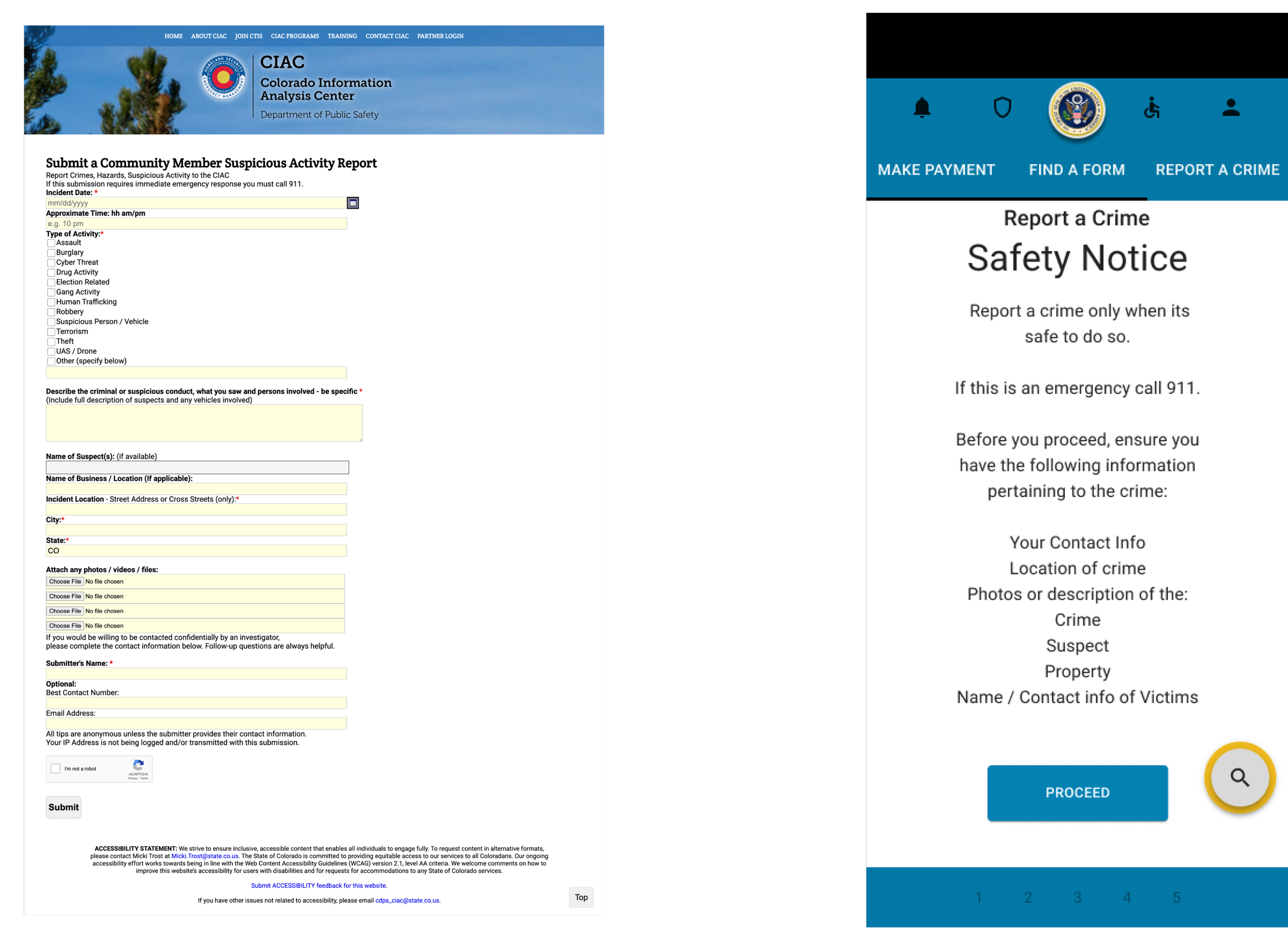
Reporting a Tip / Crime process difficulties
Navigational challenges in finding information and forms
-
Consolidating key actions into one platform
Addressing reporting a crime pain point with drop-pin feature
Simplifying site-map, user interactions and processes

Research:
-
Comparative Analysis of foreign Gov Websites ( Canada )
Comparative Analysis of differences between US Gov Websites
Remote moderated interviews & Surveys
Unmoderated Remote User Tests
8 User Responses to Screen Survey
1 Participant arrived to Interview
-
Out of 8 Respondents, only 1 Participant followed through with the interview.
-
Inconsistent site architecture and UX of US .Gov Sites
Canadian Gov sites have consistent Site Architecture & Branding across all Branches.
Fragmented user flows across different government websites
“Standardization of templates would be extraordinarily beneficial.”
“The way you have to get to stuff at times.....you’re going 1520pages deep... then it’s like... ‘You have to call us’”
Ideation:
-
Referencing Canadian Government layout and design
Comparative Analysis of US Government Websites
Developing a Citizens Dashboard solution
-
Addressing pain points through consolidated actions
Providing a centralized interface for user interactions

Prototyping:
Iteration based on Feedback

-
Notes
Pages
Zinnia
Google One Suite
Figma / Figjam
Material Design / UI Components
-
Sketches

Wire Frames

Low Fidelity Proto Types


Testing:
-
Challenges related to limited participants and timeframe to complete project hindered testing.
-
Conversational usability testing
Feedback gathered from Colleagues & Friends

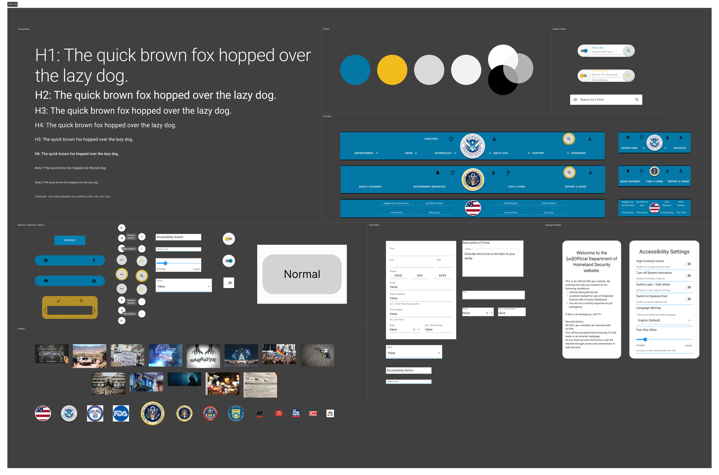
Visual Design:
-
Inspiration from Canadian government websites
Consistent layout and neutral color palette
each branch would retain its current branding
Results & Conclusions
Before

-
Improved user experience and streamlined interactions
-
Simplifying reporting a crime process and more
-
Enhancing usability, engagement, and satisfaction
Upon further refinement of Interface, additional User Tests will take place
After

Lessons:
-
Importance of style guide
User testing documentation
Case Study framework needs refinement
-
Applying established lessons and methodologies to Future Projects
Wire-framing and Lofi-Midfi Prototyping in Figma
Utilizing components more effectively in Figma
Seeking Research Participants sooner and sourced via more applicable outlets
Future Directions:
-
Addressing additional pain points and challenges.
Site Architecture for other .gov site / branches
Dashboard Tiles / Content
-
Applying lessons from case study to future design endeavors
-
Creating prototypes for other branches
Refining dashboard functionality
Identify User flows that need enhancement
Acknowledgments:
-
- Jason Daniel Lutz - UI / UX Designer / Researcher
LinkedIn: Connect with Me
Email: jason.lutz@du.edu
-
Input and feedback from UI/UX colleagues, research participants
Thank You for your Insights and Feedback:
8 Respondents, 1 Interview Participant
and my to Colleagues:
Cassandra
Nicci
Bryan